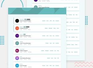
Design comparison
SolutionDesign
Solution retrospective
This is my first adaptive page. I failed to figure out how to make the content align evenly when there are two columns of cards. The sections with job requirements do not always match in height at that point. Would be glad to hear suggestions or some general feedback :)
Community feedback
- @MasterDev333Posted almost 4 years ago
Great work @IR-afn. Your solution is spot on. Everything is fully responsive and close to design. It would be great if you add some transitions for listing-item__tag. You used BEM and I like it. Happy coding :)
0
Please log in to post a comment
Log in with GitHubJoin our Discord community
Join thousands of Frontend Mentor community members taking the challenges, sharing resources, helping each other, and chatting about all things front-end!
Join our Discord
