

Design comparison

Solution retrospective
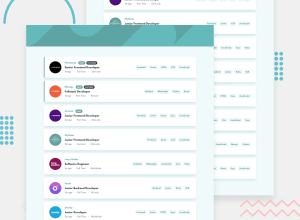
Any feedback would be most welcome on this one.
I was a bit unsure of the best markup for this one. In the end I went for checkboxes rather than buttons, and I think this holds up OK - if you remove the CSS it is easier to see.
I also had to add in some odd padding values to the pill shaped elements and the labels as I couldn't get the font vertically centered. Any alternative suggestions on this would be welcome.
I should also add that having tested this with a screen reader there is still quite a bit of work needed with labels and focus to make this work nicely.
Thanks again for any feedback.
Sept 21: I just updated this to improve the transitions of elements on and off the page and remove the janky feel to the page. Any comments most welcome.
Community feedback
Please log in to post a comment
Log in with GitHubJoin our Discord community
Join thousands of Frontend Mentor community members taking the challenges, sharing resources, helping each other, and chatting about all things front-end!
Join our Discord