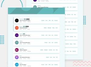
Static Job Listings Challenge with Astro, ReactJS, and TailwindCSS
Design comparison
Solution retrospective
The biggest problem I had building the project was sharing state between Astro islands. At first, I used React Context to manage state app-wide, but that doesn't work in Astro. Instead, they provide their own version of app-wide state management called Nano Stores, which was a bit tricky to use at first, but got more familiar as I spent more time with it.
The only area in my code I wasn't completely positive on was the positioning of the cards when the filter bar is toggled. At first, I used absolute positioning for the header, but found that you could also use relative positioning for setting the top/right/left/bottom CSS properties. I'm still not sure if there was a better approach to this, but as it stands right now, the app looks like the challenge.
Unfortunately, I didn't focus too much on accessibility this time around, so there's not much styling in that department.
Community feedback
Please log in to post a comment
Log in with GitHubJoin our Discord community
Join thousands of Frontend Mentor community members taking the challenges, sharing resources, helping each other, and chatting about all things front-end!
Join our Discord
