Static Job Listing With Filtering
Design comparison
Solution retrospective
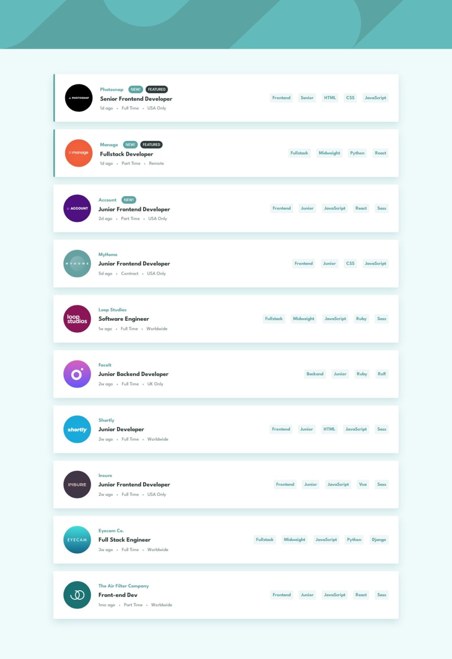
I'm proud of the fact that I defined which components I should create to match the design. the main ones are:
- Job: this is to represent each job listing on the page.
- JobFilter: this is to represent the filter box that shows up when filtering jobs.
The above main components are wrapped in a layout component called Box. and there are other low level components such as: RemoveButton, ClearButton, Tablet and Badge to represent smaller pieces in the UI.
Each components has it's own CSS file for the basic styles. I also used CSS properties for the components that share some aspect of the layout / design.
I wouldn't do anything differently next time. though i'm looking to learn new technologies / libraries that builds upon react.
What challenges did you encounter, and how did you overcome them?The interactivity wasn't much an issue during this challenge. the state is quite simple. maybe if the jobs weren't static that would've added more complexity. the main challenges I encountered were in respect to the CSS and the layout.
I solved most of them using Grid, flexbox and transform properties. with some calc usage to get stuff right.
I'd like to understand if my code is readable, understandable and follows best practices.
As always any feedback is welcomed.
Thank you so much for viewing my solution!
Please log in to post a comment
Log in with GitHubCommunity feedback
No feedback yet. Be the first to give feedback on Abouelhouda Iliass's solution.
Join our Discord community
Join thousands of Frontend Mentor community members taking the challenges, sharing resources, helping each other, and chatting about all things front-end!
Join our Discord
