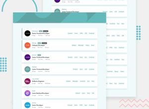
Design comparison
SolutionDesign
Solution retrospective
Feedback required
Community feedback
- @Mahesh-yadavPosted over 4 years ago
Hi
Good work. My few suggestion are:
-
Set
cursor: pointeron filter tablets to give feedback to the user that these are clickable. -
On mobile design, the company logo is not placed correctly. To achieve this: set
position: relativeon the job card andposition: absolute; top: -10px; // should be equal to half the height of log left: 10px // should be equal to left padding on the cardon logo
1 -
Please log in to post a comment
Log in with GitHubJoin our Discord community
Join thousands of Frontend Mentor community members taking the challenges, sharing resources, helping each other, and chatting about all things front-end!
Join our Discord
