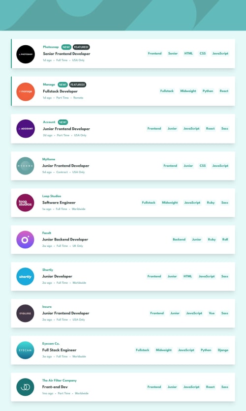
Submitted about 1 year agoA solution to the Job listings with filtering challenge
Static Job Listing Site
motion, react, tailwind-css, redux
@nivrii

Solution retrospective
What are you most proud of, and what would you do differently next time?
Used useReducer instead of useState for state management
What specific areas of your project would you like help with?An absolute element that has the green edge for the first two NEW and FEATURED items makes the container bigger and slightly makes it bigger than the rest. I'd like help on how to style an absolute element and for it not to increase th size of its container.
Code
Loading...
Please log in to post a comment
Log in with GitHubCommunity feedback
No feedback yet. Be the first to give feedback on Nivrii's solution.
Join our Discord community
Join thousands of Frontend Mentor community members taking the challenges, sharing resources, helping each other, and chatting about all things front-end!
Join our Discord