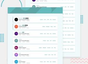
Design comparison
Solution retrospective
This is my first time using TailwindCSS to do the styling so the design would sometime look buggy.
- Problems:
- I don't know how to properly position the search bar when it's resized. I mean the search bar is supposed to push the contents downwards when it's got more tags, but I cannot do it.
- I cannot position the logo in each card component when it's resized
Hope to get helpful feedbacks
Community feedback
- @aweliegoPosted about 1 year ago
Hi Copper, and congrats for completing the challenge 🎉
I wanted to try and help you with the problems you mentioned:
-
Regarding the issue on small screens with the search bar overlapping on the listings when there are many filters: currently in your App component, you call the Filter component inside the background div. If you call it just after the div instead, the issue you mentioned doesn't exist anymore. Of course you will need to adjust some styles in your Filter component (like removing the absolute position) to make it look good, but just to give you a starting point :)
-
Regarding the position of the company logo on small screens: on small screens you could set the logo in an
absoluteposition (inside your div which is alreadyrelative) and adjust-translate-yuntil it's in the right location. Then on medium sized screens, override these styles with thestaticposition and reset-translate-yto default. You will also need to adjust the spacing of the text content around and make the image smaller but I hope this gives you an idea of how you can achieve it :)
I hope this helps and wish you good luck! 🔥
Marked as helpful1 -
Please log in to post a comment
Log in with GitHubJoin our Discord community
Join thousands of Frontend Mentor community members taking the challenges, sharing resources, helping each other, and chatting about all things front-end!
Join our Discord
