Submitted 8 months ago
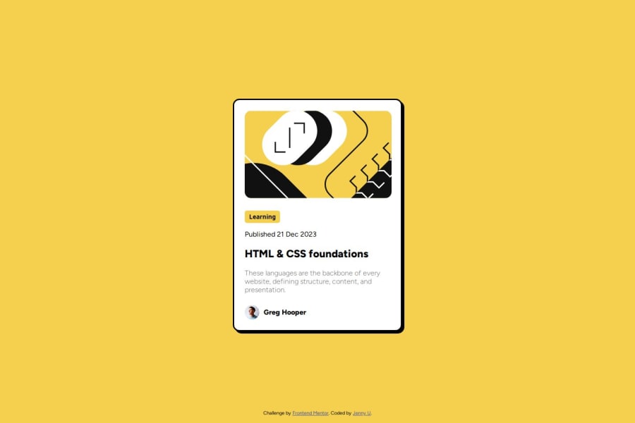
Static Blog preview card using HTML and CSS

@eatwanderexplore

Design comparison
SolutionDesign

Solution retrospective
What are you most proud of, and what would you do differently next time?
Being able to change the size/placement/order of each element is very satisfying.
What challenges did you encounter, and how did you overcome them?I didn't realize the category tag on the blog preview card was a button at first so I had trouble trying to make the padding match the design. Once I realized it was a button it made it a lot easier.
What specific areas of your project would you like help with?I'm not sure how to use the figma files to help me with these projects.
Community feedback
Please log in to post a comment
Log in with GitHub
Join our Discord community
Join thousands of Frontend Mentor community members taking the challenges, sharing resources, helping each other, and chatting about all things front-end!
Join our Discord