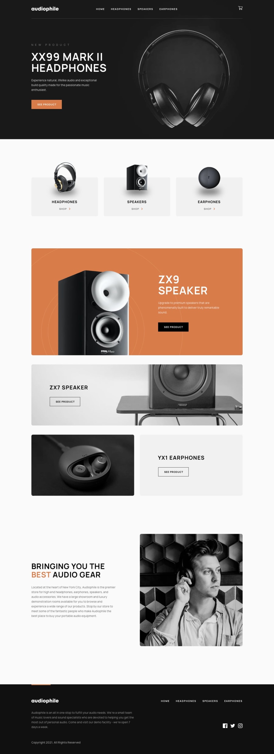
Design comparison
SolutionDesign
Solution retrospective
imbuing local storage into the project
Community feedback
- @ChamuMutezvaPosted over 2 years ago
Greetings Nazir Abubakar
Congratulations for taking one of the exciting challenges. You have done a wonderful job so far. I am working on the same project using React , Context api and Mongodb. I have covered much ground but still have a lot to do. Besides that , here is my observation.
- on small devices , look at the
css-ju9a15class - the content is not centered mainly due the padding-left property. I would opt to usepadding-inline: 2remwhich caters for both the right and left side.
.css-ju9a15 { height: 450px; color: var(--chakra-colors-white); width: 100%; margin: auto; padding-top: 10rem; padding-left: 4rem; text-align: center; }- i would encourage to let your content decide the size of the container, having a set height on a container can cause some responsive issues trying to make sure that all the content fits. For example check on mobile the large white space after the footer.
- the headphone background image is stretching way too much in my opinion, there is 3 sets of images which can be used for mobile, medium and desktop devices. To keep the aspect ratio , read the following article about: [responsive background images]https://www.smashingmagazine.com/2013/07/simple-responsive-images-with-css-background-images/)
- the logic implementation is working as expected , well done. One bug that is causing the site to break is as follows:
- When the cart is populated.
- Remove all the items from the cart.
- Select checkout. One quick solution is to disable the checkout button when the cart is empty.
Happy coding
Marked as helpful0 - on small devices , look at the
Please log in to post a comment
Log in with GitHubJoin our Discord community
Join thousands of Frontend Mentor community members taking the challenges, sharing resources, helping each other, and chatting about all things front-end!
Join our Discord
