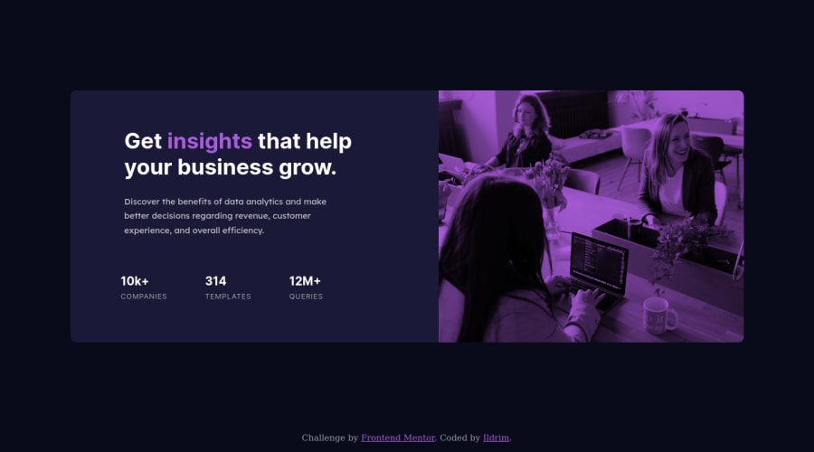


Design comparison

Solution retrospective
Hello this is my second project, but i really struggled on this one, and i seriously need some feedback, since i feel that my code is really messy on this one.
My main problem was that the transition from mobile to desktop (since im working mobile first) using flexbox was a bit weird as far as responsiveness go. The image would be responsive but in an erratic way like changing size and leaving the background color from the blend visible to which my only solution was to min-max width the breaking points which feels kinda wrong or idk.
also regarding the flexing part, the only way i managed to flex was to encapsulate the texts and image in 2 different boxes so i can flex them, and then on the the texts box use smaller boxes for the rest of the text/lists so i can work with them, flex them etc.. was this approach and way of thinking correct?
since i never received any feedback on my first project i really hope that someone will help me a little bit on this one.
thanks a lot in advance.
Community feedback
Please log in to post a comment
Log in with GitHub
Join our Discord community
Join thousands of Frontend Mentor community members taking the challenges, sharing resources, helping each other, and chatting about all things front-end!
Join our Discord