Submitted about 3 years ago
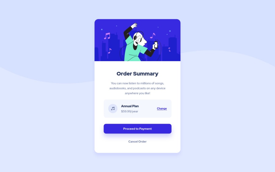
Starting the Frontend Mentor journey with the easiest challenge
@ibnsamy96
Design comparison
SolutionDesign
Solution retrospective
I like the constructive feedback and waiting for it.
Community feedback
- @kens-visualsPosted about 3 years ago
Hey @ibnsamy96 👋🏻
- In your markup,
<div class="">...</div>
should be<main class="">...</main>
. This will fix the accessibility issues, but don't forget to generate a new repot once you fix the issues. - Next, for the music icon, add
aria-hidden="true”
, because it's for decoration. You can read more aboutaria-hidden
here. - Also, I suggest adding
transition: all 0.2s;
to the button and the links, this will make:hover
smoother.
I hope this was helpful 👨🏻💻 Other than that, you did a pixel perfect job, well done. Cheers 👾
Marked as helpful1@ibnsamy96Posted about 3 years agoThanks @kens-visuals for your feedback. I appreciate it and solved my accessibility issues with the help of it.
0 - In your markup,
Please log in to post a comment
Log in with GitHubJoin our Discord community
Join thousands of Frontend Mentor community members taking the challenges, sharing resources, helping each other, and chatting about all things front-end!
Join our Discord