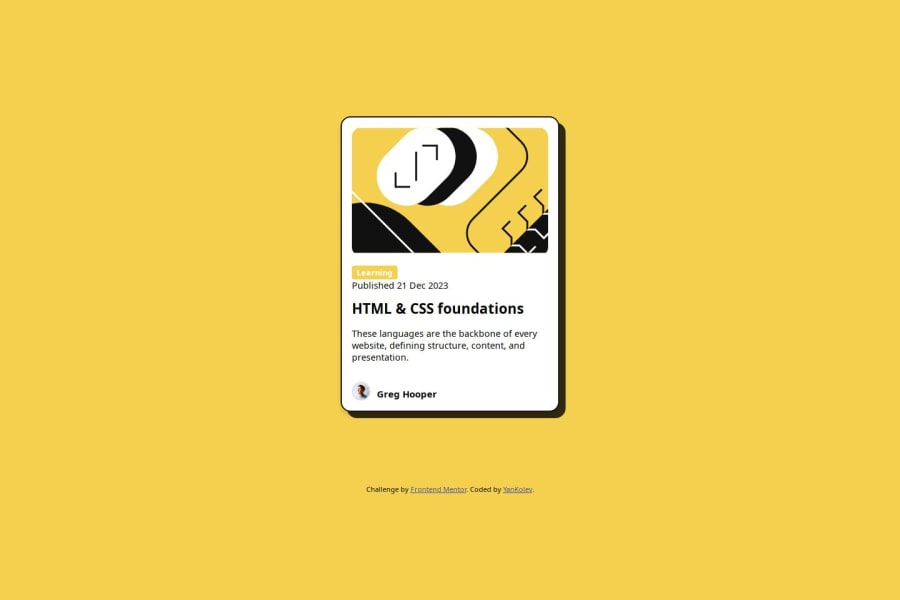


Design comparison

Solution retrospective
Proud-Improvement using flexbox. Differently-improved dimensions and/or media queries.
What challenges did you encounter, and how did you overcome them?For this build- the box-shadow property... how close, yet so far I was from making it similar to the design. After some diving in the mdn docs and experimenting the fact that you can have 2 part box-shadow was a big revelation.
What specific areas of your project would you like help with?Any feedback on improving the code structure or more optimized approach will be welcome.Thanks!
Community feedback
- P@huynhvanngoanPosted 2 months ago
I think your solution is quite ok, however there are some points to note: the height of the card is not correct with the design and also the pointer effect when hovering and the color change effect when hovering on the title. I think you need to edit a little bit there and it's ok
Marked as helpful0@YanKolevPosted 2 months ago@huynhvanngoan Hi! Thank you for taking the time to look into the solution and the feedback! Have a great day!
1

Please log in to post a comment
Log in with GitHubJoin our Discord community
Join thousands of Frontend Mentor community members taking the challenges, sharing resources, helping each other, and chatting about all things front-end!
Join our Discord