

Design comparison

Solution retrospective
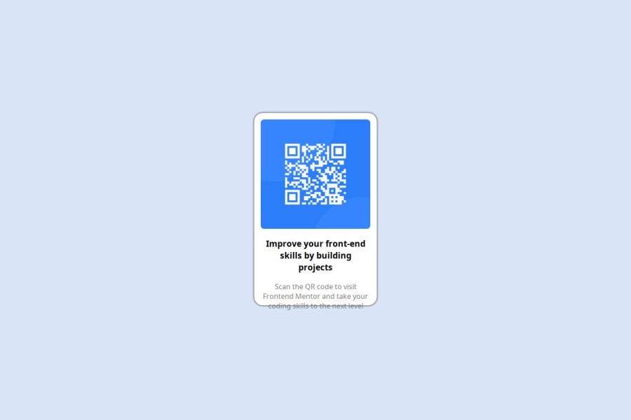
Definitely proud of getting this project to look eerily similar to the original in under a hour. Being familiar with HTML and CSS through freeCodeCamp lessons allowed me to quickly know where to start and what to do. One thing that I would do differently is not spend so much time on one problem that I'm not able to implement.
What challenges did you encounter, and how did you overcome them?There was one B I G challenge that I encountered and sadly was not able to recreate. It being the slight box shadow under the card which I spent about 15 mins at the end of everything else trying to figure how to make it. It's very subtle and faint if you notice it. Even for the fate of humanity I wasn't able to overcome this problem. sigh.
What specific areas of your project would you like help with?One problem I would like help with is understanding the parent and child relationship css has to its core with elements. I'm not so sure if I did it completely right but eventually I settled on using the margin property to get the div holding the card to the center of the page. Knowing how and where to set up the Display, Justify-content, Text- align properties to get the style on any given area of the webpage would motivate me more than David Goggins running everyday. The other advice I would like some pointers on is how to use a computer and how to use the internet, this is a problem that has puzzled me for centuries.
Community feedback
- @AtatraPosted 8 months ago
Well done on finishing it so fast! Your retrospective was fun to read.😄
I don't think it's a bad idea to take more time on stuff you're not acquainted with though. I started this journey with little knowledge of CSS & HTML, and it took me waaaay too long to accomplish my first challenge (well, it still takes me too much time... haha). The reason being I googled every single thing I didn't know. Of course if you're stuck on something for too long, it's better to move on and do what you know, then come back. Just like you did! So it's not a bad thing to do. :)
For shadows I recommend looking at examples, this is a good start. Search for ones that look close enough to your desired shadow, then tweak it as you please.
What helped me get of clearer view of how flexboxes work is Flexbox Froggy. It's fun to play and it is quite helpful. When I did the QR Code Component, my thought process was:
- I need to make the card sits exactly at the middle of the page.
- For that, my component that will contain the card must take 100% of my viewport's height. (Body or main in this case). One way is with
min-height: 100vh(width: 100%for width). - Now that my parent component fits the entire height. I can center all its children vertically (it didn't work as expected before, bc my body's height was the height of all its children!) + horizontally. Just as you did, I used
display: flex. justify-content: centerto align its children along the main-axis (here it is the x-axis because flex-direction is set torowby default).align-items: centerto align its child along the other axis.
At each step, I
inspect elementmy webpage to look at the boxes of each element.. So I know what I'm doing. It helps visualize stuff and realize that every elements are just little boxes with margins & paddings put inside/alongside one another.Hope my comment will be useful to you. I may have made some mistakes, so feel free to google it & experiment it on another challenges ! 😁
Marked as helpful0@univxrsePosted 8 months agoThank you for your time & your reply Atara!! :) I actually played Flexbox Froggy before very small world. I also really love the website you provided for the box shadow examples. @Atatra
1

Please log in to post a comment
Log in with GitHubJoin our Discord community
Join thousands of Frontend Mentor community members taking the challenges, sharing resources, helping each other, and chatting about all things front-end!
Join our Discord