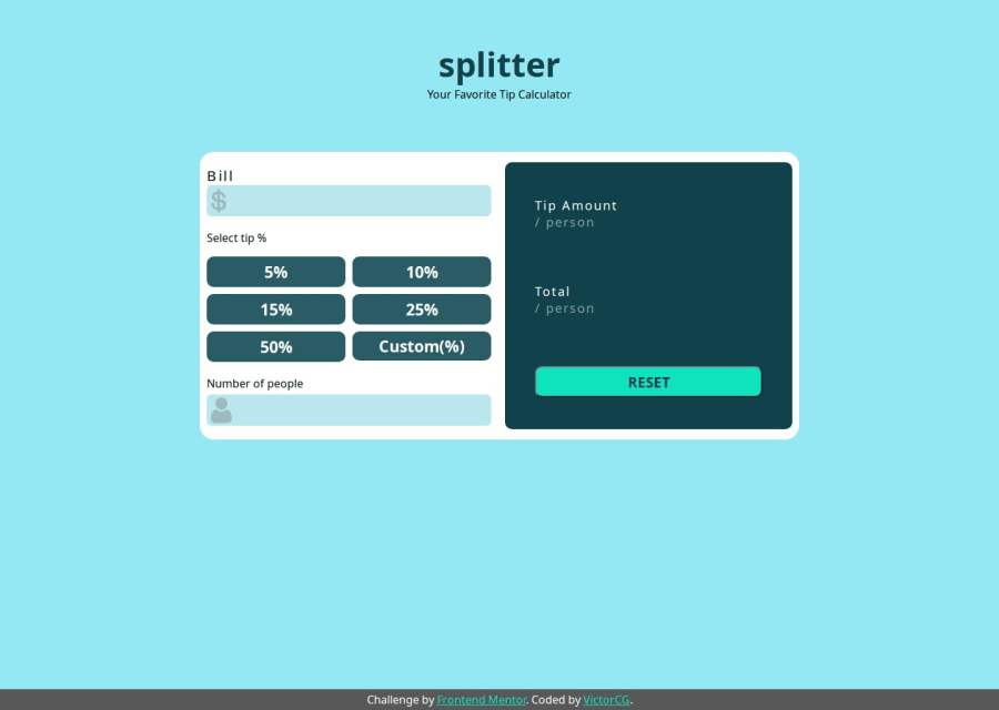
Design comparison
SolutionDesign
Solution retrospective
This was more complex than I expected. it required focus and I learned a lot from it.
Community feedback
- @danielmrz-devPosted 9 months ago
Hello @IamVictheCG!
Your project looks great!
I have one suggestion for you to improve it even more:
- Using
marginis not the best option to center an element. Here's a very efficient (and better) way to place an element in the middle of the page both vertically and horizontally:
📌 Apply this to the body (in order to work properly, don't use position or margins):
body {
    min-height: 100vh;
    display: flex;  /* it works with grid too  */
    justify-content: center;
    align-items: center;
}
I hope it helps!
Other than that, great job!
1 - Using
Please log in to post a comment
Log in with GitHubJoin our Discord community
Join thousands of Frontend Mentor community members taking the challenges, sharing resources, helping each other, and chatting about all things front-end!
Join our Discord
