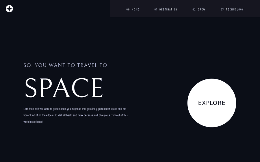
Design comparison
Solution retrospective
This project was quite challenging for me because it involved three different breakpoints. However, through this project, I learned a lot about responsiveness and how to approach Figma designs. Additionally, I had the opportunity to use Three.js SphereGeometry on the destination page, which was a new and exciting experience.
While building the project, I found it difficult to make the font size responsive. Despite using the clamp function, I was not satisfied with the output. Furthermore, I was unable to implement how to change the background image based on pages and device width. I would greatly appreciate any guidance on these issues.
As this was my first time implementing Three.js, I may encounter issues related to the size of geometry. Therefore, I am unsure about certain areas of my code.
Community feedback
Please log in to post a comment
Log in with GitHubJoin our Discord community
Join thousands of Frontend Mentor community members taking the challenges, sharing resources, helping each other, and chatting about all things front-end!
Join our Discord
