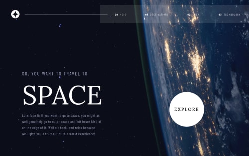
Space tours with Reactjs, react-router 6, styled components

Solution retrospective
I've been learning / using React for the past couple of years and started using styled components about a year ago. I haven't been very strong with styled-components and some certain design aspects in general which I wanted to address with this project. I think styled components can be pretty powerful with the ability to use props. It was definitely a little slow going at first trying to get a good work flow with the css with getting redundant or conflicting styles in my components. I also wanted to get a feel for the limitations of S.C such as difficulty in targeting specific elements for styles and tedious debugging.
There is an issue I found with github pages with react apps which is the way the routing works. It forces you to change how it sees the root route which can cause some weird behavior with active links when using react router. It makes the root link or home link active all the time which wont happen on other platforms like Heroku to Netlify. You can usually fix this issue with using 'exact' in the NavLink props but it didn't work here. Maybe someone out there has a solution but it was beyond what I was needing for this challenge.
Let me now if there are things that could be done better or if you find some bugs. Always looking to improve and I appreciate any feedback.
Please log in to post a comment
Log in with GitHubCommunity feedback
No feedback yet. Be the first to give feedback on J.D. Browne's solution.
Join our Discord community
Join thousands of Frontend Mentor community members taking the challenges, sharing resources, helping each other, and chatting about all things front-end!
Join our Discord