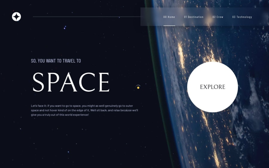
Space tourism with some custom animations + framer motion
Design comparison
Solution retrospective
Used Framer Motion for the first time (didn't go deep much, just a basic animation) and added some custom animations. I also added a 404 page. It should possible (works locally) to access it with a bad url, but it doesn't work on the Netlify page, so, i added it to the explore button, nothing too fancy.
The little Sun-Earth animation that follows the cursor needs some adjustments. It moves away from the cursor when scrolling. I’ll probably need to disable it on mobile too.
What specific areas of your project would you like help with?Any feedback is appreciated.
I feel like there is a way to create a reusable component for all pages to avoid redundancy, but I couldn’t manage it due to differences in order and styling.
I wasn’t sure whether to use the or tag for the numbers on different pages. Since screen reader users will already know what page they’re on, I went with .
I am very beginner to the React. Is the folder structure good?
Community feedback
- @KapteynUniversePosted 4 months ago
Oh yeah, text presets... Went with my own sizes because i only saw one font size for each preset on the design system of Figma file but they are changing mobile - desktop.
0
Please log in to post a comment
Log in with GitHubJoin our Discord community
Join thousands of Frontend Mentor community members taking the challenges, sharing resources, helping each other, and chatting about all things front-end!
Join our Discord
