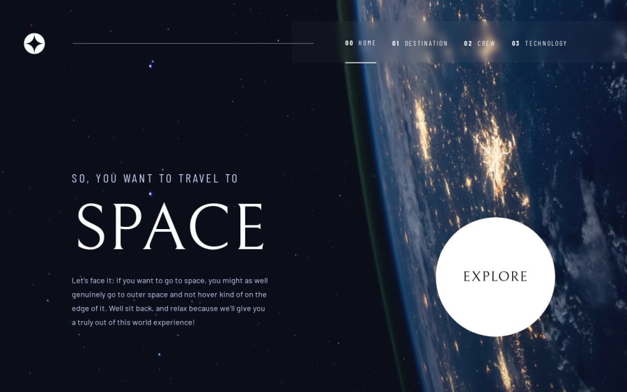
Design comparison
SolutionDesign
Solution retrospective
What are you most proud of, and what would you do differently next time?
I'm mostly proud of creating responsive design across all devices, especially for the navbar.
What challenges did you encounter, and how did you overcome them?The most challenging part was styling the right way images and make them responsive.
What specific areas of your project would you like help with?One thing that I want to improve is removing FOUC when loading for the first time different pages and switch between them, if anyone has a solution for it or want to leave feedback let me know. All of them are welcome.
Community feedback
Please log in to post a comment
Log in with GitHubJoin our Discord community
Join thousands of Frontend Mentor community members taking the challenges, sharing resources, helping each other, and chatting about all things front-end!
Join our Discord
