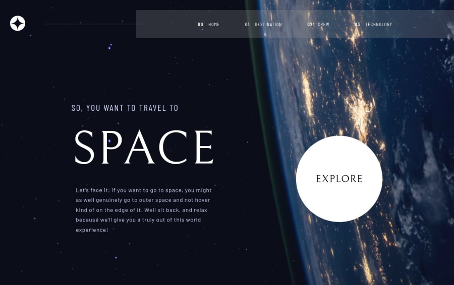
Space tourism - with React and Framer Motion
Design comparison
Solution retrospective
Hey guys,
This is my first React project. Well... there are some part I'm satisfied with and others, less so >.< I'm quite happy with an overall layout, especially the mobile and tablet view. The backdrop filter also looks super pretty (too bad Firefox still doesn't have support for it).
What I'm not happy out is the layout shifts. Especially in the Crew tab, the content "jumps around" a fair bit. It only happens on the initial load. Tried to find a way around it with some animations but I'm still a bit clueless how to solve it, so if anyone has any idea, I'd be happy to hear it.
I'd love to hear other feedbacks too on how to improve my work, as usual ^^ Have a great day!
Community feedback
- @brasspetalsPosted over 2 years ago
Hi, Fluffy Kas! I’m a bit late to this party, but…
I struggled with a similar issue in the tabbed section of my Dine solution. Although we used different tools (React & Framer Motion vs. Svelte), hopefully I’ll be able to help a little here.
The shifting happens worst on initial load on the technology and crew pages, and unfortunately it also occurs to a lesser degree with every tab change on the crew page.
For the crew page, I believe the text is shifting due to the change in container height caused by the images all being different sizes. Setting a
min-heighton the container equal to the height of the tallest image should help prevent this. The crew image shifting looks to be caused by the image flex container changing to the the size of the new image before the old one leaves the DOM. Is there a way you could change your animation to have the old one fade out before the new one loads? I apologize, as I’m not familiar with framer motion. Perhaps you can use a setTimeout function to give the old content time to leave the DOM before the new content enters? Again, another option might be to set a min-height and min-width on the image container so the size isn’t shifting with each tab change.To prevent the initial flashing, you have to find a method to pre-load your images. For me this resulted in a major refactor, putting all the content in the DOM (rather than dynamically loaded as you have done here), and toggling
display: nonealong with some animations. However, given your img srcsets are pretty simple, you might be able to use preload or do something similar to this method in React.Why do tabbed sections have to be such pain? 😭 Your solution overall is fantastic, though - and the animations on the destination page are great! I really like the subtle rotation of the moons (and Mars!). 🙌
Marked as helpful1@FluffyKasPosted over 2 years ago@brasspetals it's never late, I always appreciate feedbacks! ^_^
Hehe, yup, I was playing around so much with the Crew section height and it's still not perfect.. The whole thing would look a lot better if I could figure out "exit animations". I tried to implement it because I thought about the same, that maybe animating them "out" would help but I'm still struggling with it >.< Will definitely return to this challenge, once I learn how this works with Framer Motion!
Preloading the images is a good idea! Thanks for the article, it seems pretty useful. I give it a go soon!
Thanks for the kind words Anna and the time you took to check this out ^_^
1
Please log in to post a comment
Log in with GitHubJoin our Discord community
Join thousands of Frontend Mentor community members taking the challenges, sharing resources, helping each other, and chatting about all things front-end!
Join our Discord
