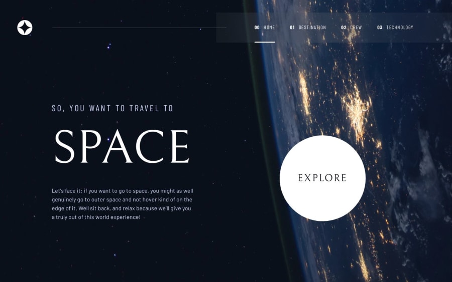
Space Tourism Website with Next.js + Tailwind CSS
Design comparison
Solution retrospective
Upon taking this challenge, what comes to my mind is to try and build it with what Next14 has to offer. I was able to try the latest app router contrary to the pages router. There are a lot of major changes in Next14, especially the project structure.
There are a few different approaches how to build this website but I chose a simple static page with a little bit of JavaScript (tabs, sliders, mobile menu).
The Figma design is quite interesting and covers desktop, tablet, and mobile. I'm having so much fun trying it with a CSS grid for the overall layout and I think it turns out quite well but not perfect.
What challenges did you encounter, and how did you overcome them?Probably, the overall layout is just by using a CSS grid. Every page and breakpoint has a different grid layout and item placement. You have to be very keen and have an eye for detail.
I usually put smart lines to plan my grid layout on the Figma design then use this very useful tool to visualize my CSS grid and generate the code for you.
What specific areas of your project would you like help with?I wanted to apply some animations or transitions so it doesn't look very static and boring. I'm kinda very poor in this department. Please feel free to give me your favorite library for animations or transitions. I would like to check them out.
Community feedback
Please log in to post a comment
Log in with GitHubJoin our Discord community
Join thousands of Frontend Mentor community members taking the challenges, sharing resources, helping each other, and chatting about all things front-end!
Join our Discord
