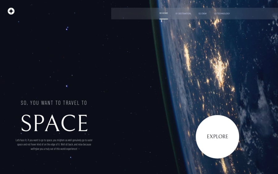
Space Tourism Website using Svelte and TailwindCSS
Design comparison
Solution retrospective
Well, I'm proud to not really have had significant difficulties when creating this intermediate-level challenge.
I'm quite happy that I have used Svelte/SvelteKit for the first time; of course, I still don't have significant hands-on experience to compare against another framework like React, but, for this 1st experience, Svelte was simpler to get things done, especially considering state change/observability, than what I'm used to in ReactJS land.
For the next projects, I'm intending on not using so much of pixels as the base unit of sizing; there are a few other units, especially 'em' and 'rem', and I intend on using them, for the cases in which it makes sense.
What challenges did you encounter, and how did you overcome them?Keeping the aspect ratio of the crew screen images; it was challenging because I had to deal with different images with different dimensions, and how I could handle that wasn't obvious at first glance.
Deploying a Svelte app to production took a few tries as well, it was particularly annoying to do that on GitHub Pages; on Netlify, the deploy process was way smoother.
What specific areas of your project would you like help with?For people with experience using Svelte, I'd love for you to take a look at how I have used the framework; nothing fancy for now.
I'd also enjoy feedback on my TailwindCSS usage; guess I could've gathered more cross-page styling in the tailwind.config file, in order for greater reuse.
My use of pixels throughout the project; I'm still to really understand the use cases for other size units, so comments on that would also be helpful.
Community feedback
Please log in to post a comment
Log in with GitHubJoin our Discord community
Join thousands of Frontend Mentor community members taking the challenges, sharing resources, helping each other, and chatting about all things front-end!
Join our Discord
