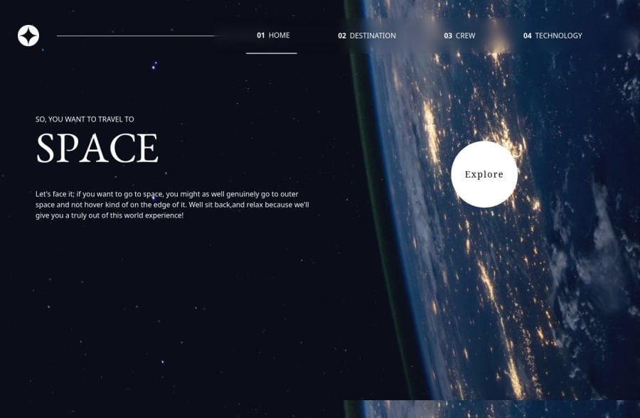
Space Tourism Website using React,TailwindCSS and Vite bundler
Design comparison
Solution retrospective
I have learnt how to effectively use React Router to navigate through the website pages(routes).I have also learnt how to use and customize react tabs while using data.json file to populate the website from the destination,crew and technology data objects.
What challenges did you encounter, and how did you overcome them?I have had a challenge applying different background images depending on the route selected.I will be doing more research on how to improve the website.
What specific areas of your project would you like help with?I will appreciate some help on displaying different background images for different routes as it is in the challenge design.
Community feedback
- @edwinc73Posted 3 months ago
pretty cool!!!
To change the bg just used scss and depending on the section id I changed the image url. I found this to be the best way. you can check out mine to help you get a better idea
https://github.com/edwinc73/frontend-mentor-advanced-css/tree/master/05-space-tourism https://space-tourism-spa.vercel.app/
You can also have the image with a repeat none and change the object fit of the image so it doesnt tile.
you could use
max-w-7xl mx-auto
which will define the max width to 1280px and then center the containers. This is good so it limits how far apart elements are in a screen.i think in some elements there are some strange border radius values I think this is because of border-radius: 50%, the 50% will make it so a rectangle will become an oval shape.
Marked as helpful0 - @edwinc73Posted 3 months ago
pretty cool!!!
To change the bg just used scss and depending on the section id I changed the image url. I found this to be the best way. you can check out mine to help you get a better idea
https://github.com/edwinc73/frontend-mentor-advanced-css/tree/master/05-space-tourism https://space-tourism-spa.vercel.app/
You can also have the image with a repeat none and change the object fit of the image so it doesnt tile.
you could use
max-w-7xl mx-auto
which will define the max width to 1280px and then center the containers. This is good so it limits how far apart elements are in a screen.i think in some elements there are some strange border radius values I think this is because of border-radius: 50%, the 50% will make it so a rectangle will become an oval shape.
Marked as helpful0@matthewkuriaPosted 3 months ago@edwinc73 Thank you for your time and feedback. I will surely read your code ,I believe it is priceless, I will benefit from it.Again, Thanks!
0
Please log in to post a comment
Log in with GitHubJoin our Discord community
Join thousands of Frontend Mentor community members taking the challenges, sharing resources, helping each other, and chatting about all things front-end!
Join our Discord