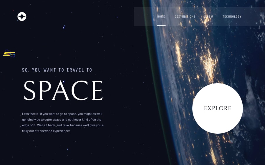
Space tourism website using React, with a cartoonish twist ;)
Design comparison
Solution retrospective
What did you find difficult while building the project? 1- making it social media sharable since the build tool (vite) I used had some issues with linking assets from meta tags. 2- the vertical carousel in the technology page (desktop mode)
Which areas of your code are you unsure of? I coded the website so its content can be fully configurable, and this is how I created the cartoonish variable by creating one extra file only. however, I am unsure of some decisions I made about its architecture.
Do you have any questions about best practices? what would be the best design pattern for such project? creating templates for pages, or pages components as it's now, how can I make the configuration system more solid
Community feedback
- @siavhnzPosted over 1 year ago
Hello Ali
I liked your solution especially vertical slider in technology page and also cartoon mode is funny I didn't expect that, I enjoyed it :)
Happy coding
2
Please log in to post a comment
Log in with GitHubJoin our Discord community
Join thousands of Frontend Mentor community members taking the challenges, sharing resources, helping each other, and chatting about all things front-end!
Join our Discord
