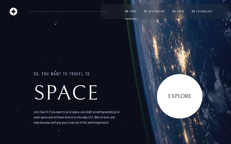
Design comparison
SolutionDesign
Solution retrospective
What are you most proud of, and what would you do differently next time?
I am proud of this whole project, it was not easy at all.
What challenges did you encounter, and how did you overcome them?Biggest challenges were to make website seem as identical as i can.
What specific areas of your project would you like help with?I would like help and reviews about anything that someone sees but especially about images and how to make them responsive and have good quality. Thanks
Community feedback
Please log in to post a comment
Log in with GitHubJoin our Discord community
Join thousands of Frontend Mentor community members taking the challenges, sharing resources, helping each other, and chatting about all things front-end!
Join our Discord
