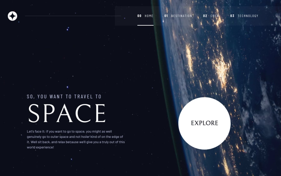
Space Tourism website - responsive and accessibility ready
Design comparison
Solution retrospective
The only problem I had is with the image of the Launcher, in the Technology page. If I simply make a media query in CSS to alter the picture, the images of the other technologies wont load when clicking the numbered buttons (I'm loading the information/images using the .json file).
So, inside window.onload, I had to verify the media query and if it was in desktop size, alter the image of the launcher (the other ones are not necessary since it will load correctly when clicking the numbered buttons).
Any better solution for that would be greatly appreciated.
Despite that, I enjoyed a lot doing this project. Kevin Powell helped a lot in the layout tweaking, making the solutions easier than I have imagined them to be.
Community feedback
- @joaotextorPosted almost 2 years ago
Update: figured out a solution on the technology page problem. Simply added a <picture> element inside HTML with a picture for desktop screens. No need for CSS nor JS. Thank you Kevin Powell for today's YouTube short for this advice ;-)
Kevil Powell video that solved my problem: https://www.youtube.com/shorts/d9i68C628Nk
0
Please log in to post a comment
Log in with GitHubJoin our Discord community
Join thousands of Frontend Mentor community members taking the challenges, sharing resources, helping each other, and chatting about all things front-end!
Join our Discord
