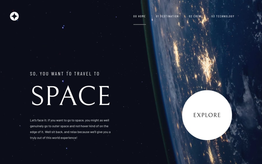
Space Tourism Website project (using React and Sass)
Design comparison
Solution retrospective
Any feedback? I is my first project :D
Community feedback
- @GabrielAbubakarPosted almost 3 years ago
Hey man.. This is a really awesome solution with this project
I have been working on it for a couple of days now but I am using next.js instead of react because of it's routing and SEO capabilities which I think you should have considered for your solution since you are already familiar with React
I am pretty much done but I haven't figured how I would implement the changing of tabs
0 - @Nam-HaiPosted almost 3 years ago
This is a really interesting approach to the design to be honest. You basically put the 4 page one next to the other and just translate to the one you need. This is quite original. I guess there might be advantages to ur approach as everything is already loaded and thus there are no loadscreen or anything, the code is really simple, native Js (i think). All theses make the code appealing.
However, the normal approach is to give each of the page its own url (or routing component if you are working with js framework). Here it doesn't matter, but imagine a bigger website, your approach is just not scalable.
On this specific design, the only bad side of your approach would be when you are on the 2nd, 3rd or 4th page when changing width size of the window the page does an awkard readjusting, but that's nitpicking.
0
Please log in to post a comment
Log in with GitHubJoin our Discord community
Join thousands of Frontend Mentor community members taking the challenges, sharing resources, helping each other, and chatting about all things front-end!
Join our Discord
