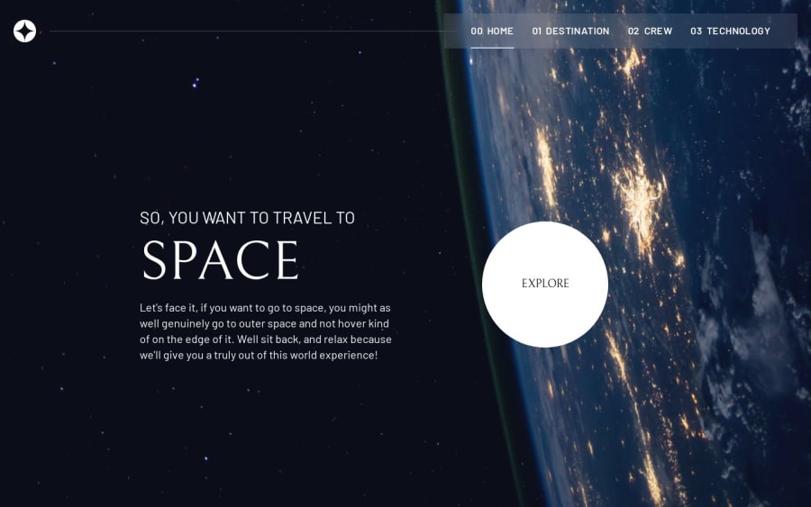
Space tourism website
Design comparison
Solution retrospective
I'd love to hear your thoughts! Your feedback is greatly appreciated and helps me improve.
Community feedback
- @Mahmoud-ElagamyPosted 5 months ago
Hello Ahmed,
I’ve been exploring the Space Tourism app, and it’s visually impressive and engaging! However, I noticed one small usability issue on mobile that affects the user experience:
Mobile Menu Drawer: When I open the menu drawer on a mobile device and select a page, the drawer stays open instead of closing automatically. This requires the user to manually close the menu after each selection, which can impact the overall UX by adding extra steps. It would be great if the drawer could close automatically once a page is selected, allowing users to view the selected content immediately.
Thank you for your hard work on this app! This small change could make a significant difference in the flow for mobile users.
Marked as helpful0@AhmedLebdaPosted 5 months agoHey @Mahmoud-Elagamy, thanks so much for the awesome feedback! I’m really glad you’re enjoying the Space Tourism app!
You’re absolutely right about the mobile menu drawer – that extra step can definitely be a bit annoying. I’ll definitely look into making the drawer close automatically after selecting a page to make things smoother for mobile users. Appreciate you pointing that out!
Thanks again for taking the time to share this, and I really appreciate your support!
0
Please log in to post a comment
Log in with GitHubJoin our Discord community
Join thousands of Frontend Mentor community members taking the challenges, sharing resources, helping each other, and chatting about all things front-end!
Join our Discord
