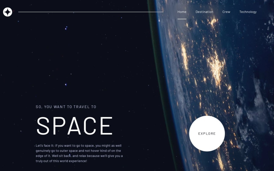
Design comparison
Solution retrospective
I am very proud from bringing this project as close as the original one! Scrimbas course and Kevin Powel helped me understand a lot of things that wasn't clear to me before!
What challenges did you encounter, and how did you overcome them?Organizing my code was something that i got struggled with. The lesson that I followed gave me inspiration and new ways of organizing css html and js.
What specific areas of your project would you like help with?Accesibility is something that I need to study. I also think that asynchronous functions is something that I don't fully understand
Please log in to post a comment
Log in with GitHubCommunity feedback
- P@aouintihouari
Well done, only improvement maybe changing some font family for some parts in the content to adapt the original design, also the explore button should be clickale and lead to the destination page
Marked as helpful
Join our Discord community
Join thousands of Frontend Mentor community members taking the challenges, sharing resources, helping each other, and chatting about all things front-end!
Join our Discord
