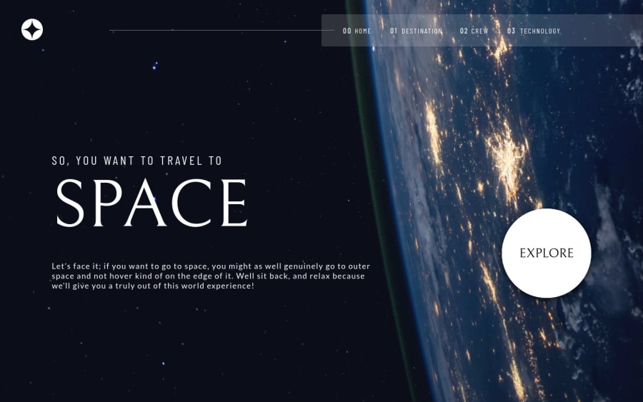
Design comparison
SolutionDesign
Solution retrospective
The project was a lot of fun. I'm not very good with CSS yet, so it was a good challenge.
My biggest problem in this project was the picture of the crew member on the desktop version. I couldn't position all of them perfectly at the bottom and had some trouble. Can anyone point me to the right way to do it?
Join our Discord community
Join thousands of Frontend Mentor community members taking the challenges, sharing resources, helping each other, and chatting about all things front-end!
Join our Discord

