Submitted almost 3 years ago
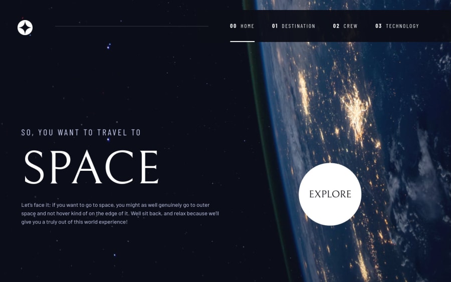
Space tourism using css grids
#accessibility#bem
@plainsight16
Design comparison
SolutionDesign
Community feedback
- @RioCantrePosted almost 3 years ago
Hello there! Great work with this one. Regarding the solution you submitted, I think you should also take notes of the following…
- Change the color value of the nav background into
background: hsla(223, 10%, 83%, 0.3); - Clean the whitespaces in the code
Above all, The design looks good. Keep it up!
0 - Change the color value of the nav background into
- @Jay-0331Posted almost 3 years ago
hey man, really great work.
just want to say that in the technology tab that 1 2 3 navigation buttons it is a bit pressed just define a certain height and width or give some padding for buttons it will look great.
everything else looks good both on mobile and desktop. :)
0 - @Kamasah-DicksonPosted almost 3 years ago
Your solution looks good on mobile good job Keep coding👍
0
Please log in to post a comment
Log in with GitHubJoin our Discord community
Join thousands of Frontend Mentor community members taking the challenges, sharing resources, helping each other, and chatting about all things front-end!
Join our Discord
