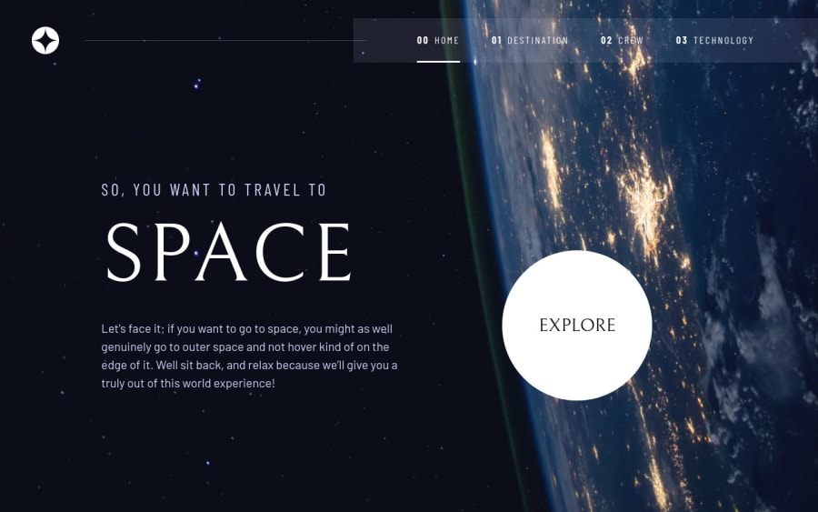
Design comparison
Solution retrospective
Hello! I've been learning react and I hope someone can give some feedback about my folder structure and if the code is easy to read/understand or not. I want to improve my skills so all kind of feedback is welcome!
I wanted to include switching pages/tabs animations but I realized I don't know how to do that haha so I'll learn about it and I hope I'll be able to include animations in future challenges
Community feedback
- @thevolcanomanisherePosted over 2 years ago
You did a really great job on this project. I had a quick look at your folder structure and nothing jumped out as wrong! You have a well defined folder structure with things in their logical place.
For the background on your nav -> Add blur + opacity and it will match the reference design much closer.
Marked as helpful0@dennebPosted over 2 years agoHello! Thank you, I appreciate you taking the time to look at my solution =D!
0@thevolcanomanisherePosted over 2 years ago@denneb check this out https://developer.mozilla.org/en-US/docs/Web/CSS/backdrop-filter
0
Please log in to post a comment
Log in with GitHubJoin our Discord community
Join thousands of Frontend Mentor community members taking the challenges, sharing resources, helping each other, and chatting about all things front-end!
Join our Discord
