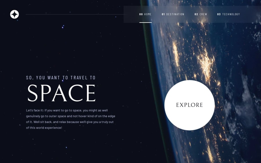
Design comparison
Solution retrospective
This is the largest single site I've worked on thus far! Next time I'll continue using utility classes wisely to keep my layouts and styles more consistent. It was also a leap of faith using ReactJS, I'd have been far more comfortable with vanilla HTML/CSS/JS. I learned much about this library, and can see I'm just scratching the surface at the same time.
What challenges did you encounter, and how did you overcome them?I learned React Router for this project to visit separate pages, and struggled to give them all distinct backgrounds before thinking of using custom page-specific styles in the JSX. The final page layout was difficult, I had to keep experimenting with values and declarations to make things fit.
What specific areas of your project would you like help with?The button functionality on the Technology page can occasionally be wonky, and I'm not sure why. I did what I could to mitigate the issue so it wouldn't throw out errors. All in all there are some messy inconsistencies in my code, and some of it feels like it's held together by duct-tape (lol) But I'm proud of my work on this milestone project and for seeing it through.
Community feedback
Please log in to post a comment
Log in with GitHubJoin our Discord community
Join thousands of Frontend Mentor community members taking the challenges, sharing resources, helping each other, and chatting about all things front-end!
Join our Discord
