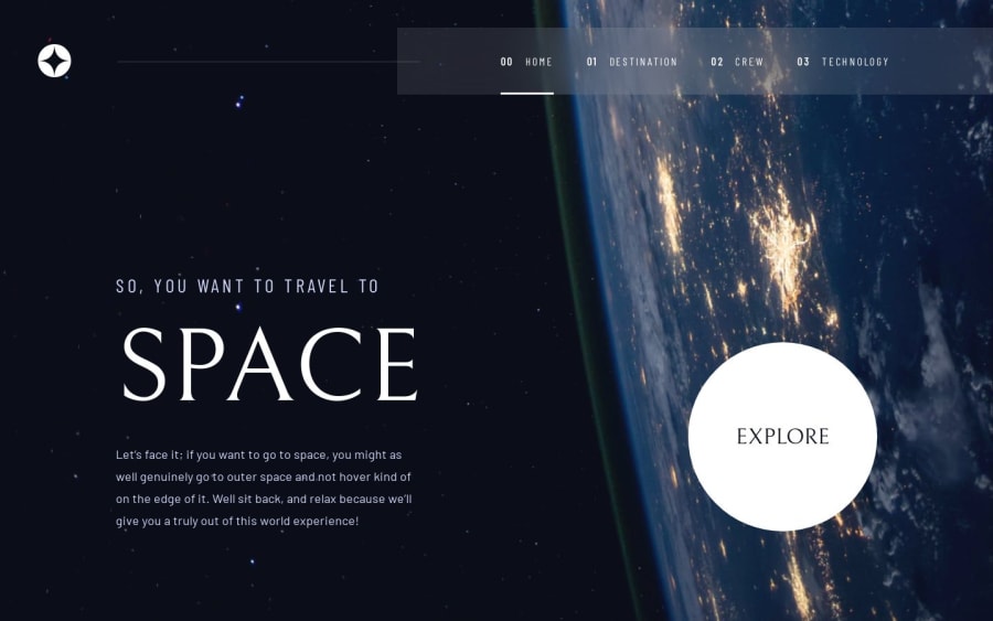
Space tourism multi-page website NextJS


Design comparison

Solution retrospective
A ton of work. I expect it would be somehow fast and easy but next is working quite different than regular js/css/react. I still can't figure out how to animate svg for burger menu, but that's simple in usual project. Even for this i used a library that implements burger as a bunch of div's. I really enjoy this challenge, so wish everyone to challenge this. =)
Please log in to post a comment
Log in with GitHubCommunity feedback
- @Haaguitos
Hey, Shchetkov!
Awesome solution! The smooth animations and redirects make it a great experience browsing through your website, and I really like how you made the application icon redirect to the homepage (believe me, not everybody does that)!
I'll leave some points here as a feedback:
- On the tecnology tab, the image could have more spacing between it and the text on web devices, since there is a big free space on the right;
- still on technology tab, but on cellphones, there is no spacing between the texts, and some gap could increase the readability;
- on the crew tab, the images don't have fixed size, so the screen jumps when changing to Douglas Hurley, caused by the scrollbar appearing.
Hope it helps!

Join our Discord community
Join thousands of Frontend Mentor community members taking the challenges, sharing resources, helping each other, and chatting about all things front-end!
Join our Discord