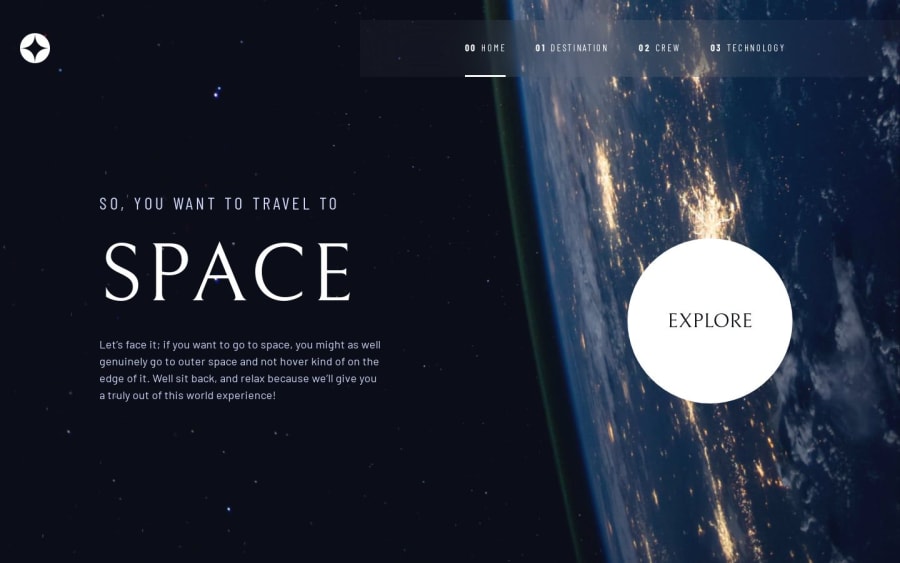
Space tourism multi-page website (html,css, js)
Design comparison
Solution retrospective
I started by following along Kevin Powell's course on this project, I just used it as a general guide for creating the design elements in a separate html file (all the buttons and such) at the start, after that I tried putting the site together by doing all the html/css/js myself.
I felt the css gets really bogged down in a lot of media queries and gets kinda tiresome to keep track of. Maybe I should just get in the habit of commenting sections more?
I also find it pretty difficult to really get the pages to be 100% faithful to the previews. Not sure how important it is that every gap is the right amount etc.
Anyway I did all the pages for mobile/pad/desktop and I'm pretty happy with the result, but if anyone wants to take a look and offer some general thoughts that would be nice of you. Thanks
Community feedback
Please log in to post a comment
Log in with GitHubJoin our Discord community
Join thousands of Frontend Mentor community members taking the challenges, sharing resources, helping each other, and chatting about all things front-end!
Join our Discord
