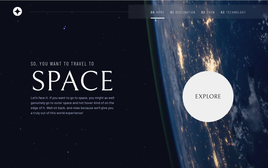
Design comparison
Solution retrospective
I did transition on cards to be more interactive. I loved to do this challenge. Really excited about the result.
Any feedback will be amazing!
Community feedback
- @vladmeePosted over 1 year ago
Great job! Your project looks excellent, almost pixel-perfect!
I like that you added extra stuff, I noticed the flip animation on the mobile menu toggle. That's a nice touch!
The animation on the tabs is nice too but, as @Cor-Ina already mentioned, this is not really a UX improvement. Yes, users prefer reduced motion, but another thing you should consider here is to not move the controls. The tab buttons should always be predictable for the user. Imagine someone wanting to check all options before making a decision. They would want to click on each tab in a sequence. In your solution, their tab buttons run away before they can click. They are coming back but the brain tells you something else until the animation is done. You know what I mean, right?
In this case, I would consider other types of animations and only affecting the content (image, text etc.) elements that change! You can have the text blink (opacity animation) or reveal top to bottom (size animation). That's actually a UX improvement because the user will be aware that those elements updated and she needs to read it again. Hope that makes sense! Let me suggest animista which is a nice collection of CSS animations.
And, if you want to bring it to another level you could even have the elements revealed in a sequence, one by one. That would be a great practice for you if you haven't played with delay and triggers before!
Other than that you nailed it. It looks exactly like the designs! Maybe revise your CSS a bit. I've seen a few things like
max-width: 110vw;This translates to: this element's width can't be more than 110% of the viewport width which is... impossible unless you have horizontal scroll (not advised!) So I think this line doesn't have any effect.Keep up the good work! Looking forward to seeing your next projects!
Marked as helpful1@barbaradamasdevPosted over 1 year agoHi @vladmee . Thank you for the observations. I`ll take a look in everything you said. You helped a lot 😍🙏🏻
1 - @CorinaMurgPosted over 1 year ago
Hi Barbara,
This was not an easy project to complete. Congratulations!
One suggestion: add a "prefers reduced motion" media query for accessibility reasons.
The transitions make the site more dynamic, but could be problematic for certain users. People with motion or visual sensitivity may experience discomfort when exposed to animation on the screen. For them, reducing motion can make digital content more accessible and comfortable to consume.
Beautiful work! Corina
Marked as helpful1@barbaradamasdevPosted over 1 year agoThank you very much @Cor-Ina .
I'll improve what you suggested, it makes perfect sense! 😍
0
Please log in to post a comment
Log in with GitHubJoin our Discord community
Join thousands of Frontend Mentor community members taking the challenges, sharing resources, helping each other, and chatting about all things front-end!
Join our Discord
