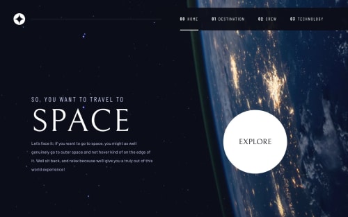
Space tourism multi-page website

Solution retrospective
On the "Crew" page, I feel like the mobile/tablet design gives the impression that the tab content can be navigated through 'swipe' gestures. I've implemented as such but I am unsure of the impact on accessibility. What are some accessibility considerations to take note of when implementing gesture navigation on websites?
On the "Technology" page, the desktop design shows the image aligned to the right. I'm hesitant to do so as I feel it would introduce huge gaps between the text and image on larger screens. My current solution has the image "aligned to the right" on certain screen sizes, however on larger screens it'll have gap to the right border. How would you go about dealing with this problem? Would you also deviate from the design?
Please log in to post a comment
Log in with GitHubCommunity feedback
No feedback yet. Be the first to give feedback on Dave Quah's solution.
Join our Discord community
Join thousands of Frontend Mentor community members taking the challenges, sharing resources, helping each other, and chatting about all things front-end!
Join our Discord