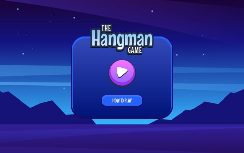
SPA hangman game using React and SCSS

Solution retrospective
I'm satisfied that I've applied my knowledge in concepts like react portals, router dom, context and reducers, even if only a little.
What challenges did you encounter, and how did you overcome them?I think back to when I first started adding styles to the menu page. At first I couldn't get the right shadow effect on the container and the button. I tried to use pseudo elements and other things, but as it turned out all this matter is solved by border width, which I simply forgot about.
What specific areas of your project would you like help with?I tried to make the game understandable when using screen readers, but I'm still not quite sure about some things. For example, when I click on the wrong button, the number of attempts is not counted, although I seem to have set the right aria attributes on the progress tag. Also, How else can I clearly let the user know in which position of the word he guessed the letter ? It was also quite difficult to fit some of the mystery words on the screen. It often looks strange on mobile devices, so I'd be interested to hear how you dealt with it.
Please log in to post a comment
Log in with GitHubCommunity feedback
No feedback yet. Be the first to give feedback on Daniil's solution.
Join our Discord community
Join thousands of Frontend Mentor community members taking the challenges, sharing resources, helping each other, and chatting about all things front-end!
Join our Discord