Not Found
Not Found
Not Found
Not Found
Not Found
Not Found
Not Found
Not Found
Not Found
Not Found
Not Found
Not Found
Not Found
Not Found
Not Found
Not Found
Not Found
Not Found
Not Found
Not Found

Submitted

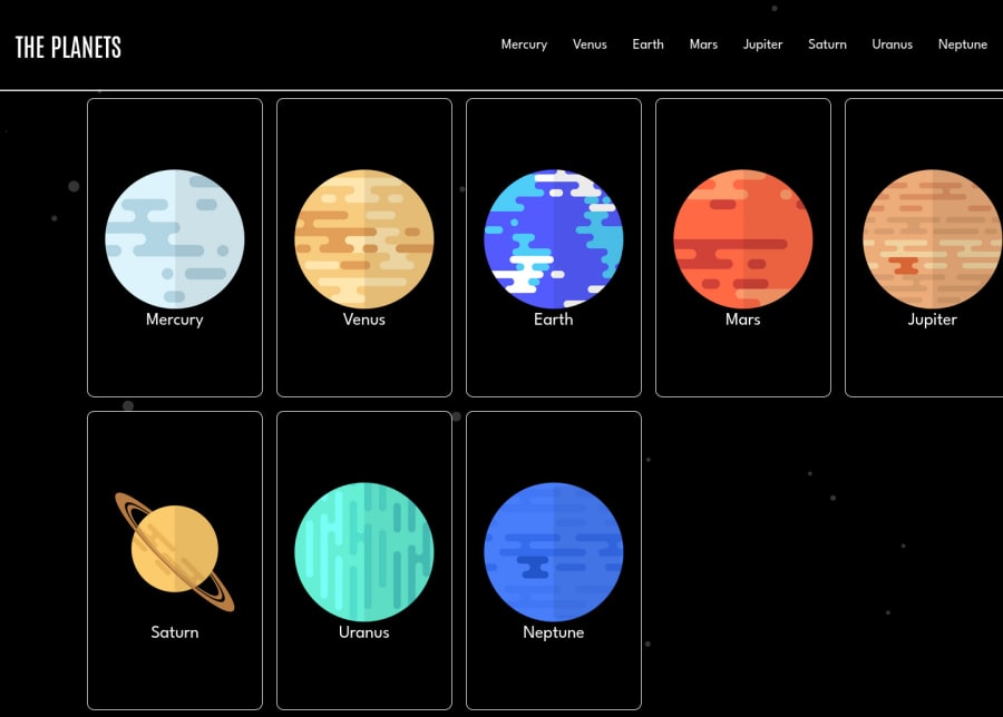
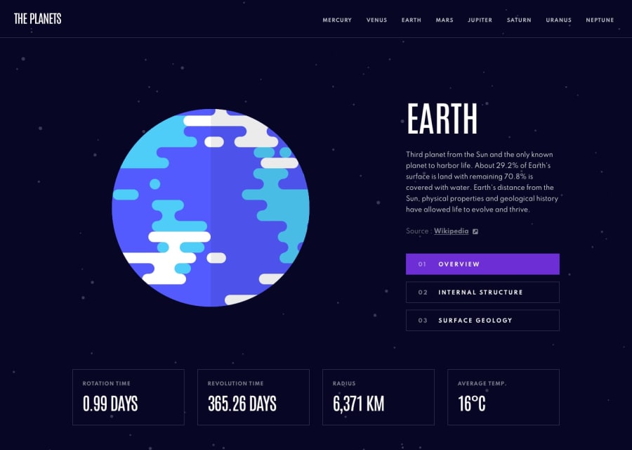
SPA concept using React.js

@ribeiroAllison

Desktop design screenshot for the Planets fact site coding challenge

This is a solution for...

  • HTML
  • CSS
  • JS
3intermediate
View challenge

Design comparison


SolutionDesign

Solution retrospective


This was my first time doing a project with React Router post version 6.

Also was the most complex media query on CSS I've done so far.

Community feedback

Robert 170

@waffleflopper

Posted

Kudos on taking the design and making it your own - not something people usually do. Just some things I noticed could be improved/challenge you to do:

On the main page in the desktop view I'm able to scroll to the right and see a huge white bar going down the screen because your desktop container is set to 100% but also has a left margin. This can be solved by seeing box-sizing: border-box; on your :root in CSS. By default margins are not taken into account when calculating the width of a container. so because you have a container set to take 100% of the available width (which in your case is the entire screen) and then set a 8% left margin on it, the total width becomes 108% which causes your planet panels to overflow the horizontal bounds of the screen. Either removing the margin-left or setting the box-sizing on the root should solve this problem. Some additional reading can be found here.

Regarding the use of margin-left to center the content - this isn't typically how you should center content. Using a setting auto is usually what I do if I'm not relying on align-items or justify-content within a flex box.

I noticed you have a margin of 10px on the planet tiles themselves, as well. I would recommend taking advantage of the gap property on the flex containers to do this for you. As well as looking at the flex-grow, flex-shrink, and flex-basis (which can be shorted handed using flex: [num] [num] [num];) properties on the planet cards for their sizing. WC3Schools is a good place to reference and FlexBox Froggy is a great little browser puzzle/game to learn about flex boxes and what you can do with them. (Grid Garden is the equivalent for Grid, which would have been a good use case for your planet cards).

I plan on diving more into your site later but I'm out of spare time at the moment, unfortunately. You're off to a great start (and congrats on writing your first custom React hook!) and you should be proud of what you've accomplished. Take a look at the resources and look at refining your CSS skills. There's no shame in starting with some of the easy free challenges and finishing them out completely with CSS. I've noticed a lot of people are more likely to look at the repository and comment on it when it's pure HTML & CSS, versus using a library like we did for this challenge. Kevin Powell has done a couple of the free ones and in general his youtube channel has taught me a ton and really brought me to enjoy working with CSS, rather than being frustrated with it at every turn.

An absolutely FANTASTIC, bullet point guideline for interfaces can be found at Rauno Freiberg's portfolio site. It's a great way to make sure the user experience is consistent throughout your site. A big one that helped me is (as a general rule) keeping any transitions below 150ms. Keep on grinding and dive deep on CSS - I personally feel it's the most important thing to learn for front-end developers.

Marked as helpful

0

@ribeiroAllison

Posted

Hey, Robert.

Thanks so much for the detailed review of my code. I made the changes you suggested and it really improved my dashboard design!

I also checked your solution, really liked the way the changing of the planet sizes does not affect at all the position of the text and link. It gives the impression that all the planets have the same center, despises their different radii. Will be sure to dive into your code to figure out how you pulled it off.

Only thing I noticed that can be improved is that for lower resolution screens (my laptop in 1366-by-768) there is no margin at the bottom of the planet details section.

Also, this awesome project deserves a nice README :)

Anyway, thanks again for taking the time to check out my work!

Cheers, Allison

0

Please log in to post a comment

Log in with GitHub
Discord logo

Join our Discord community

Join thousands of Frontend Mentor community members taking the challenges, sharing resources, helping each other, and chatting about all things front-end!

Join our Discord