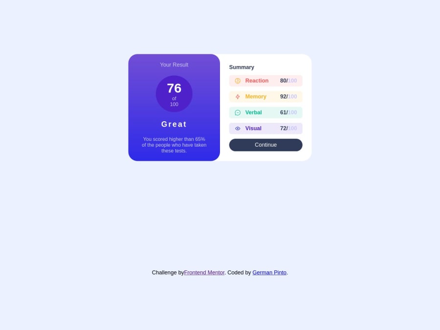
Design comparison
SolutionDesign
Solution retrospective
This challenge was a little bit complex for make some designs, but not difficult at all
Community feedback
- @petritnurediniPosted 11 months ago
Congratulations on completing your project! Your application showcases a neat and functional design. Here are some quick recommendations for improvement:
-
Styling Best Practices:
- Consistent Naming: Use consistent and descriptive class names for CSS.
- Use CSS Variables: Good use of CSS variables. Continue this for other repetitive styles like font sizes.
-
Component Structure:
- Modularity: Great job on creating separate components for Header and Body. Ensure each component is focused on a single functionality.
-
Responsiveness:
- Media Queries: Good implementation of media queries. Check the design on various devices to ensure consistency.
-
Accessibility:
- Alt Text for Images: Provide meaningful alt text for all images for better accessibility.
-
Performance:
- Optimizing Images: Ensure images are optimized for the web to improve loading times.
-
Code Quality:
- DRY Principle: Aim to follow the DRY (Don't Repeat Yourself) principle. For example, styles repeated in media queries can often be combined.
-
Learning Resources:
- For CSS best practices: CSS Tricks
- For React component design: React Official Documentation
Keep up the excellent work, and continue exploring and refining your skills! Each project brings new challenges and learning opportunities. Looking forward to seeing more of your creations!
Marked as helpful1 -
Please log in to post a comment
Log in with GitHubJoin our Discord community
Join thousands of Frontend Mentor community members taking the challenges, sharing resources, helping each other, and chatting about all things front-end!
Join our Discord
