Design comparison
SolutionDesign
Community feedback
- @eman2point0Posted 5 months ago
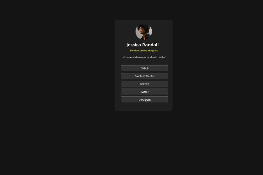
It seems that your card looks just right but the positioning of it is slightly off. I would say to perhaps get rid of the
position: fixedfor yourmainelement and instead use a flexbox or grid box to center the content.Marked as helpful0
Please log in to post a comment
Log in with GitHubJoin our Discord community
Join thousands of Frontend Mentor community members taking the challenges, sharing resources, helping each other, and chatting about all things front-end!
Join our Discord
