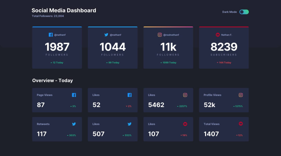
Design comparison
SolutionDesign
Solution retrospective
any feedback would be appreciate!!. Thank you!
Community feedback
- Account deleted
-
You should make whole pill clickable, than only having to click the thumb it's self to switch the theme, it'll make things way easier, & the pill also needs some padding.
-
When the window is resized you are not supposed to lose the padding, it just doesn't look right.
0 -
Please log in to post a comment
Log in with GitHubJoin our Discord community
Join thousands of Frontend Mentor community members taking the challenges, sharing resources, helping each other, and chatting about all things front-end!
Join our Discord
