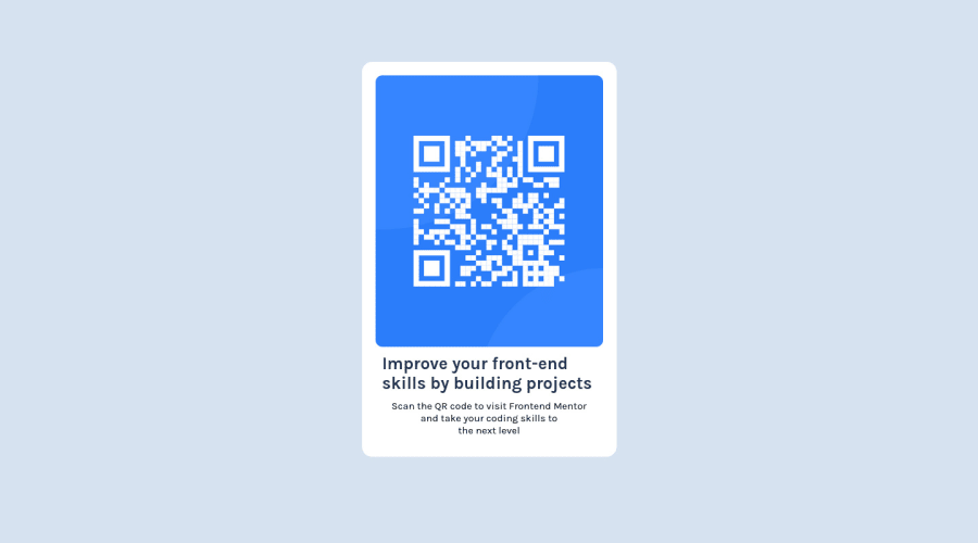
Design comparison
Community feedback
- @AdrianoEscarabotePosted almost 2 years ago
Hi Sonu Kumar, how are you? Welcome to the front-end mentor community! I really liked the result of your project, but I have some tips that I think you will enjoy:
A good practice to center content is using
gridorflex-box, avoid using margin or padding to make placements, use only in the latter case! we can do it like this:Flex-box:
body {
    display: flex;
    align-items: center;
    justify-content: center;
    flex-direction: column;
    min height: 100vh;
}
GRID
body {
    display: grid;
    min height: 100vh;
    place-content: center;
}
Document should have one main landmark, this problem is being caused by the fact that there is no main tag around the main content of the page! Since this challenge is based on only one component, there is no other component more important than it on this page, so to solve this, wrap all the content with the
maintag,It's always good to pay attention to the correct use of semantic html elements, as they are extremely important for people who use screen readers, to know what the main content of the page is in the case of the
maintag!The rest is great!
I hope it helps... 👍
Marked as helpful0@SonuKr95Posted almost 2 years ago@AdrianoEscarabote Thank You for your feedback, From next time I will include these things
1 - @SonuKr95Posted almost 2 years ago
Thank you for your feedback Adriano. From next time I will make sure to include these
0
Please log in to post a comment
Log in with GitHubJoin our Discord community
Join thousands of Frontend Mentor community members taking the challenges, sharing resources, helping each other, and chatting about all things front-end!
Join our Discord
