Submitted 28 days ago
Some responsive units and object-fit to crop img

P
@jonatan-samuelsson

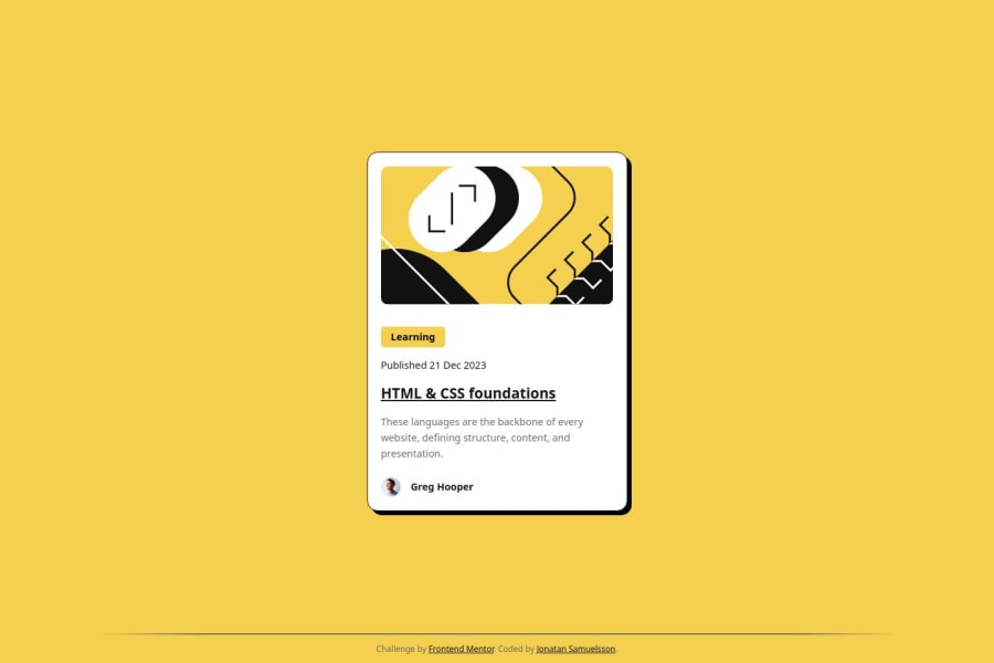
Design comparison
SolutionDesign

Solution retrospective
What specific areas of your project would you like help with?
Even though I check all the sizes (cropping the design files to get accurate widths at given screen widths etc, setting fonts to speced pixels, it differs in size, and I don't know why
Community feedback
- @Georgeburn94Posted 28 days ago
Hey Jonathan,
Great job on the project so far! You nailed the sizing perfectly, which is awesome to see. I just wanted to share a few friendly notes to help align things a bit closer to the original design and tidy up the code:
-
Design Tweaks:
- The underline on the heading isn’t present in the original design, so you can remove that.
- The font and text size are slightly different from the design—adjusting these will help match the look and feel.
-
HTML Feedback:
- You’ve got a small HTML thing to clean up: the
role="main"is redundant because the<main>element already tells screen readers it’s the main content. You can simplify it like this:<main> - (This is optional, but it’s a good practice to keep your code clean and avoid duplication!)
- You’ve got a small HTML thing to clean up: the
You’re doing really well, and these small tweaks will make your project even stronger. :)
Marked as helpful0 -

Please log in to post a comment
Log in with GitHub
Join our Discord community
Join thousands of Frontend Mentor community members taking the challenges, sharing resources, helping each other, and chatting about all things front-end!
Join our Discord