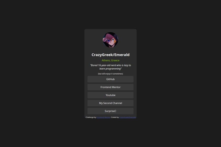
Not Found
Not Found
Not Found
Not Found
Not Found
Not Found
Not Found
Not Found
Not Found
Not Found
Not Found
Not Found
Not Found
Not Found
Not Found
Not Found
Not Found
Not Found
Not Found
Not Found

Submitted

Solutioned the thingamajig

@CrazyGreekGR

Desktop design screenshot for the Social links profile coding challenge

This is a solution for...

  • HTML
  • CSS
1newbie
View challenge

Design comparison


SolutionDesign

Solution retrospective


What are you most proud of, and what would you do differently next time?

I used chatgpt for the div because idk web development good and I am trying to learn via just messing around with ready code and trying to understand it. I did some things myself, but the div box with the links was chatgpt and I just customized

What specific areas of your project would you like help with?

How to learn HTML, CSS and JS in a fun way and not resort to chatgpt?

Community feedback

MikDra1 6,670

@MikDra1

Posted

If you want to make your card responsive with ease you can use this technique:

.card {
width: 90%;
max-width: 37.5rem;
}

On the smaller screens card will be 90% of the parent (here body), but as soon as the card will be 37.5rem (600px) it will lock with this size.

Also to put the card in the center I advise you to use this code snippet:

.container {
display: grid;
place-items: center;
}

Hope you found this comment helpful 💗💗💗

Good job and keep going 😁😊😉

1
P
Steven Stroud 9,600

@Stroudy

Posted

Awesome job tackling this challenge! You’re doing amazing, and I wanted to share a couple of suggestions that might help refine your approach…

  • Using a <main> tag inside the <body> of your HTML is a best practice because it clearly identifies the main content of your page. This helps with accessibility and improves how search engines understand your content.

  • I would put these into a <ul> <li>, Unlike a <button> or a <div> not intended for links.

    <div class="social-links">
        <a href="https://github.com/CrazyGreekGR" class="btn">GitHub</a>
        <a href="https://www.frontendmentor.io/profile/CrazyGreekGR" class="btn">Frontend Mentor</a>
        <a href="https://www.youtube.com/@CrazyGreekGR" class="btn">Youtube</a>
        <a href="https://www.youtube.com/@sunrise_edits" class="btn">My Second Channel</a>
        <a href="https://www.youtube.com/watch?v=dQw4w9WgXcQ" class="btn">Surprise👀</a>
    </div>
  • Using font-display: swap in your @font-face rule improves performance by showing fallback text until the custom font loads, preventing a blank screen (flash of invisible text). The downside is a brief flash when the font switches, but it’s usually better than waiting for text to appear.

  • Developers should avoid using pixels (px) because they are a fixed size and don't scale well on different devices. Instead, use rem or em, which are relative units that adjust based on user settings, making your design more flexible, responsive, and accessible. For more information check out this, Why font-size must NEVER be in pixels or this video by Kevin Powell CSS em and rem explained.- Another great resource for px to rem converter.

  • Using a full modern CSS reset is beneficial because it removes default browser styling, creating a consistent starting point for your design across all browsers. It helps avoid unexpected layout issues and makes your styles more predictable, ensuring a uniform appearance on different devices and platforms, check out this site for a Full modern reset

You’re doing fantastic! I hope these tips help you as you continue your coding journey. Stay curious and keep experimenting—every challenge is an opportunity to learn. Have fun, and keep coding with confidence! 🌟

1

Please log in to post a comment

Log in with GitHub
Discord logo

Join our Discord community

Join thousands of Frontend Mentor community members taking the challenges, sharing resources, helping each other, and chatting about all things front-end!

Join our Discord