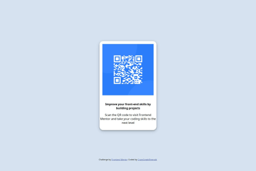
Design comparison
Solution retrospective
I am proud of this whole project, as I managed to do it on myself, no ChatGPT! Some googling was needed, of course
What challenges did you encounter, and how did you overcome them?I didn't know some things like the drop shadow behind the box, but that was easily fixed by googling and messing around
What specific areas of your project would you like help with?In this solution, I believe I did a good job, but any correction are appreciated :)
Community feedback
- @StroudyPosted 2 months ago
Hey, fantastic effort on this! You’re really nailing it. Just a few things I noticed that could make it even better…
-
Using a
<main>
tag inside the<body>
of your HTML is a best practice because it clearly identifies the main content of your page. This helps with accessibility and improves how search engines understand your content. -
Having a clear and descriptive
alt
text for images is important because it helps people who use screen readers understand the content, making your site more accessible. It also improves SEO, as search engines usealt
text to understand the image's context, helping your site rank better, Check this out Write helpful Alt Text to describe images,<img src="images/image-qr-code.png" height="288" width="288">
-
While
px
is useful for precise, fixed sizing, such asborder-width
,border-radius
,inline-padding
, and<img>
sizes, it has limitations. Pixels don't scale well with user settings or adapt to different devices, which can negatively impact accessibility and responsiveness. For example, usingpx
for font sizes can make text harder to read on some screens, Check this article why font-size must NEVER be in pixels. In contrast, relative units likerem
andem
adjust based on the user’s preferences and device settings, making your design more flexible and accessible. Usepx
where exact sizing is needed, but prefer relative units for scalable layouts. If you want a deeper explanation watch this video by Kevin Powell CSS em and rem explained. Another great resource I found useful is this px to rem converter based on the default font-size of 16 pixel. -
For future project, You could download and host your own fonts using
@font-face
improves website performance by reducing external requests, provides more control over font usage, ensures consistency across browsers, enhances offline availability, and avoids potential issues if third-party font services become unavailable. Place to get .woff2 fonts
You’re doing fantastic! I hope these tips help you as you continue your coding journey. Stay curious and keep experimenting—every challenge is an opportunity to learn. Have fun, and keep coding with confidence! 🌟
1 -
- @XavOliPosted 2 months ago
I believe the border-radius of the image could be increased to round up the edges. I would recommend looking into how to import the specific font that was mentioned in the style guide and the colors mentioned in the guide would've taken care of the difference in style for the paragraph. Overall great job!
1
Please log in to post a comment
Log in with GitHubJoin our Discord community
Join thousands of Frontend Mentor community members taking the challenges, sharing resources, helping each other, and chatting about all things front-end!
Join our Discord