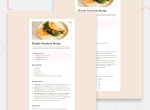
Design comparison
Solution retrospective
I am proud that I was more "bold" in trying stuff out until I find what was working. I did use ChatGPT for stuff I didn't know how to do, like how to color the dots in the prep time list and things like that
What challenges did you encounter, and how did you overcome them?As mentioned before, I solved some stuff by just googling how to do stuff and I did other stuff by asking ChatGPT.
What specific areas of your project would you like help with?Margins and positioning stuff inside a div and in general is kinda hard for me. For example, I had a kind of hard time positioning the image of the omelette in the div and the prep time div in the main div and so on and so forth. Any help is appreciated :)
Please log in to post a comment
Log in with GitHubCommunity feedback
- @Marcod01
The HTML code uses some semantic elements like <main>, <h1>, <h2>, and <p>, which helps make the structure clearer. But, using more semantic tags like <section> or <article> for the different parts like ingredients or instructions would make it even better. It’s pretty accessible since it has alt text for the image, but more could be done, like improving contrast for readability or using aria-labels for screen readers. The layout should look fine on bigger screens, but the CSS doesn't seem to account for mobile screens. Adding media queries would help it adapt better to different screen sizes. The code is mostly well-structured and easy to read, but using an external stylesheet for all styles would make it more reusable. Overall, it seems close to the design, though I can’t see the original, so there may be small differences in spacing or fonts.
Join our Discord community
Join thousands of Frontend Mentor community members taking the challenges, sharing resources, helping each other, and chatting about all things front-end!
Join our Discord
