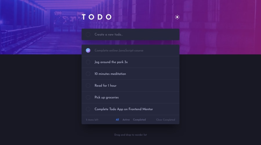
Design comparison
Solution retrospective
I used Vuex to manage the state of the list items and the dark/light theme. The list in its updated order is also saved into the local storage, so it remains the same after refreshing the browser.
Community feedback
- @ApplePieGiraffePosted about 4 years ago
Hey, Yinon Hever! 👋
Nice job on this challenge! Everything looks great and works well! 👏
I especially like the way the hero background image transitions in between light/dark themes! 🤩
Kudos for adding local storage functionality, too! 👍
Perhaps just consider taking a look at your solution report and making your solution a little more accessible. 😉
Keep coding (and happy coding, too)! 😁
1@yinonheverPosted about 4 years ago@ApplePieGiraffe Hey, thanks for the feedback. I'll add an aria-label and a submit button later on, though it should be noted that the original design doesn't include a submit button. But I suppose I could add one myself.
0 - @ezraguyPosted about 4 years ago
Hey @yinonhever, Great Job! the challenge looks great and I especially love the smooth transitions. I have only 2 suggestions. 1.In mobile mode (600px width breakpoint) maybe make the text a little bit bigger because it's a little bit hard to read. 2.When choosing a different mode of filtering (active, completed) maybe change the "All" option color to white so its clear to the user which filter he is viewing right now. Awesome job!
1@yinonheverPosted about 4 years ago@ezraguy Thanks for the feedback. When it comes to the font size and colors, I was actually just sticking to the design files to make it pixel perfect. In a real world app it indeed could be better to increase the mobile font size a bit and alter the All filter color.
1
Please log in to post a comment
Log in with GitHubJoin our Discord community
Join thousands of Frontend Mentor community members taking the challenges, sharing resources, helping each other, and chatting about all things front-end!
Join our Discord
