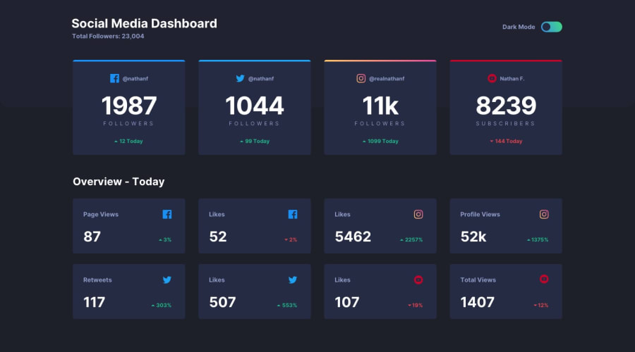
Design comparison
SolutionDesign
Solution retrospective
Any feedback appriciated.
Community feedback
- @pikapikamartPosted about 3 years ago
Hey, great work on this one. The layout is really good. This challenge is one of my favorite here in fem :>. The mobile layout is good as well and the responsiveness is great as well.
Some suggestions would be:
- On this one, I prefer adding the "Social Media Dashboard" heading tag in the
headerelement since it is up on top along with the total followers and color toggler. - Your theme switcher lacks a visual indicator on its
focus-visibleselector. Adding anoutlineorbox-shadowwould be a great addition on thefocus-visiblestate so that users would know where they are when navigating in this. The theme toggler as well lacks screen reader information, use anaria-labelattribute likearia-label="dark mode"or more descriptive one. Personally now, when I am implementing a colormode toggler, I would use thefieldsetattribute with thelegend. Contained on those are theradiobuttons that will chosen upon on the theme color modes. You can see what I mean on this challenge that I tackled on the rest api
Just those two above. This is really great. Good work.
Marked as helpful0 - On this one, I prefer adding the "Social Media Dashboard" heading tag in the
Please log in to post a comment
Log in with GitHubJoin our Discord community
Join thousands of Frontend Mentor community members taking the challenges, sharing resources, helping each other, and chatting about all things front-end!
Join our Discord
