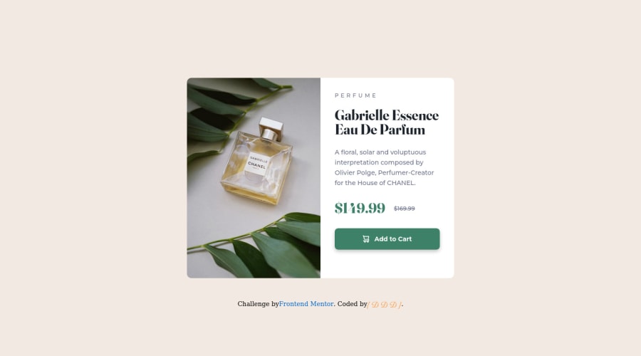
Design comparison
Solution retrospective
Your comments are welcome
Community feedback
- @correlucasPosted over 2 years ago
👾Hello DDD, congratulations for your new solution!
Your solution is really good DDD, the design elements are just fine. I think you can improve the component alignment, since you've used flexbox to create some elements, you can get rid from some margins and align everything just using
flexboxin the body, see the changes I did to your code:Note that a huge change I did was replace
max-heightwithmin-heightbody { max-width: 100vw; min-height: 100vh; background-color: #F2EAE2; display: flex; flex-direction: column; align-items: center; justify-content: center; } @media only screen and (max-width: 600px) .container { /* margin: 28px auto 50px; */ } .container { display: flex; flex-direction: row; flex-wrap: wrap; justify-content: center; /* margin: 175px auto 50px; */ align-items: center; }👋 I hope this helps you and happy coding!
Marked as helpful0@DavidDelannoyDeveloppementPosted over 2 years ago@correlucas Ahh thank you Lucas !!! I was just taking the lead with these margins on the next challenge! You are on time! lol Thanks a lot !!!
0
Please log in to post a comment
Log in with GitHubJoin our Discord community
Join thousands of Frontend Mentor community members taking the challenges, sharing resources, helping each other, and chatting about all things front-end!
Join our Discord
