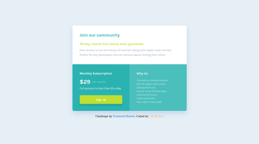
Design comparison
Solution retrospective
Your comments are welcome !
Community feedback
- @correlucasPosted over 2 years ago
👾Hello David, congratulations for your new solution!
Great solution as always David. This time I don't have much to say about your solution, is everything so good and responsive.
Replace
width: 100%withmax-width: 100%to make the container resize and scale following the screen size:.top-section { height: 216px; max-width: 100%; }You can also replace the div for each card with
<article>to improve the html code semantics.Something you can improve is the shadow that is too much smooth and nearly invisible, its better a shadow like this than one too evident, this value can be a better fit
box-shadow: 0px 15px 30px rgb(0 81 171 / 22%);thats a bit more visible.👋 I hope this helps you and happy coding!
1@DavidDelannoyDeveloppementPosted about 2 years ago@correlucas Great help as always Lucas ! 😁 I will once again take note of your advice to improve my code. Thank you for taking the time to correct my work. 👍
1
Please log in to post a comment
Log in with GitHubJoin our Discord community
Join thousands of Frontend Mentor community members taking the challenges, sharing resources, helping each other, and chatting about all things front-end!
Join our Discord
